
The Traffic Analysis Tool
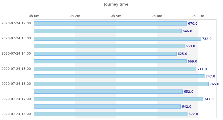 The Traffic Analysis Tool generates surveys of motor vehicle journey times (taking account of traffic congestion) as estimated by Google Maps. The tool accepts a request for a specific route and polls Google Maps to obtain predicted motor vehicle driving time repeatedly over any period between 6 hours to 14 days. The tool has recently been updated to enable users optionally to supply a personal Google API key, bypassing a Google restriction on the number of accesses per day the tool can make to the Google Directions Service. This should enable everyone to access it without encountering restrictions.
The tool and its documentation are here. Some further information and an example are here. It has been developed in collaboration with Richard Philpott of Central London CTC who hosts the tool. First released December 2016.
 The Cyclescape Issues Map
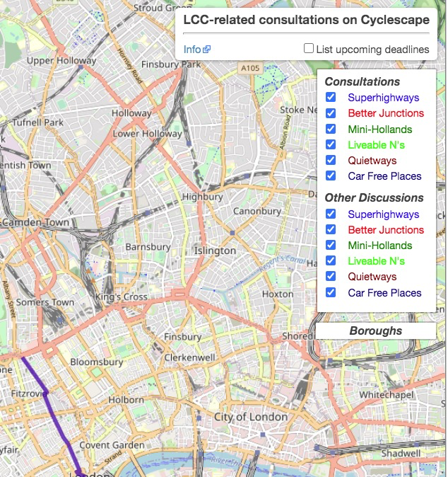
Keeps track of all the London consultations posted on cyclescape.org. In use here and here. Code and documentation on GitHub. Can be configured to produce similar real-time maps of anything posted on Cyclescape. First released Summer 2016
Interactive Maps from reports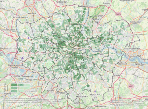
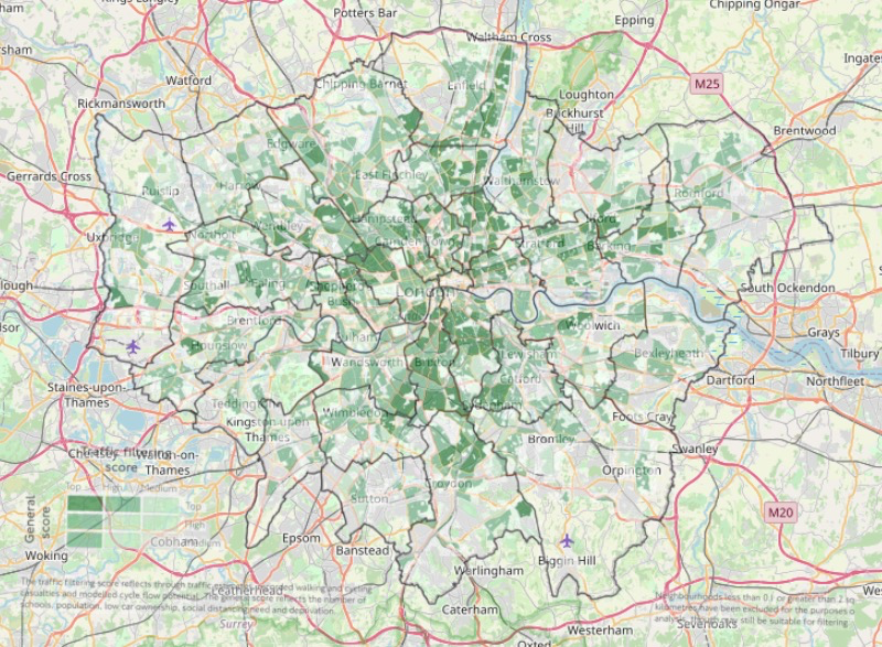
Maps constructed to make the diagrams in several TfL and Camden reports more accessible, including:
- Maps from the figures in Streetspace for London, May 2020
- Maps in some recent Camden reports
- Maps from the figures in TfL’s strategic Cycling Analysis (SCA), June 2017
produced as scalable interactive maps revealing the streets involved. First release Summer 2017, regularly updated with new maps.
 The Sheet-to-Map Tool
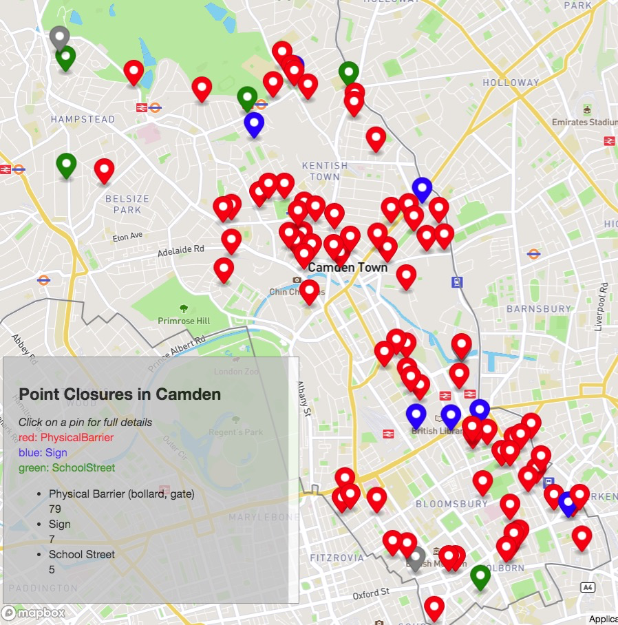
A general-purpose web app that converts a spreadsheet stored as a Google Sheet into a map showing a geo-located pin for each row in the spreadsheet. Information in the sheet can be viewed in a pop-up for each pin. As used for point closure in Camden here (the spreadsheet) and for progress with Covid-19 measures here. Sheet-to-Map Documentation here. First released May 2020. Second release pending August 2020.
Heatmap from Commonplace consultation

This map shows the density of posts and ‘likes’ posted on the Camden Safe Travel Commonplace map up to 21 April 2020.
Developed by Michael Robinson, Hounslow Cyclists, using the Tableau platform.