 Rachel Aldred ( Reader in Transport, University of Westminster) spoke to us about her new research on cycling injury risk in London. She used a large aggregate data set from TfL and looked at the risk per cyclist or per km cycled rather than concentrating on particular locations.
TfL’s Cynemon (Cycle Network Model for London) has been developed by TfL. Cynemon is based on a variety of data sources including census data, cycle counts and surveys, and data from Santander Cycles.

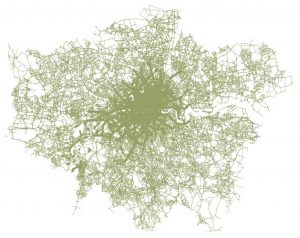
It uses an algorithm to determine the likely route of cycle trips along the networks of streets across Greater London, based on their origins and destinations made between 08:00 and 09:00 on an average weekday morning in autumn 2014. Rachel showed us a plot produced by Cynemon – see the image on the right which can be enlarged by clicking.
Rachel then told us about a new approach to the study of risk: a case control study that uses the Cynemon data to identify 6,046 control sites across the network and compares these with 6,244 injury points from Stats19 (police data of road accidents in Great Britain), also weekday 7am-7pm, 2013-4. The injury and control points were mapped onto data from other sources on speed limits, road classification, borough boundaries bus lanes, index of deprivation (IMD), location at an intersection (i.e. a junction).
Rachel then showed us a variety of outputs

- Percentage injury points by borough where the outer London boroughs fared worse that the inner ones
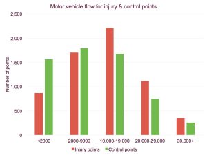
- The number of injury and control points plotted against motor vehicle flow, e.g. the best (i.e. lowest proportion of injury points) being for flows less that 2000 per hour – see the figure on the right
- The number of injury and control points plotted against motor vehicle speeds, e.g. the best (i.e. lowest proportion of injury points) being for speeds below 20 mph. 30 mph was worse than 40 mph but there weren’t many of those
Rachel then outlined a 3-stage modelling process in which the number of injury and control points were mapped against the following different sets of the available data:
- Area data – IMD and Inner/Outer London
- Area data + route environment data (infrastructure, speed limits, junction)
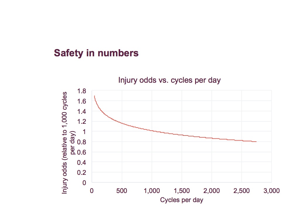
- Area data + route environment data + motor traffic flows + cyclist flows (i.e. ‘safety in numbers’ effect)
The results for intersections were as we might have expected, with intersections having over three times the proportion of injury points to control points when compared with places where there is no intersection.
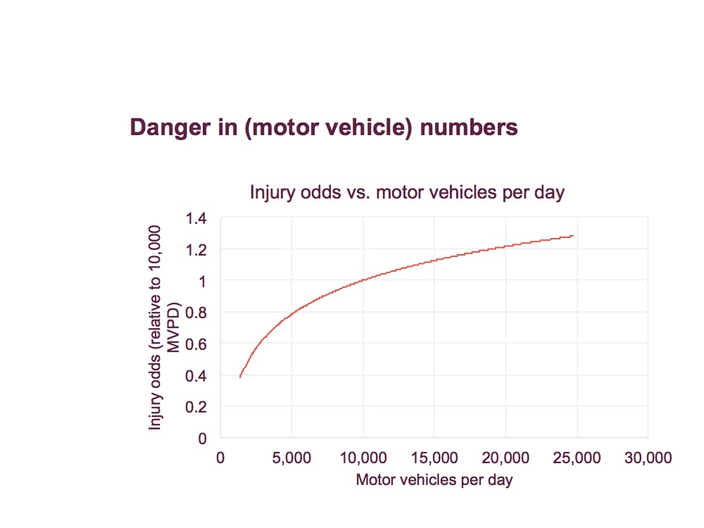
There was a wealth of comparisons but Rachel concluded by showing us graphs of the ratio of injury points to control points against the number of cycles per day and of motor vehicles per day. See below in which the injury odds are plotted against the log of the number of cycles per day and the number of motor vehicles per day.
 |
 * * |
Rachel concluded with some policy suggestions that included that the analysis supports:
- reduction of speed limits to 20mph
- reduction of motor traffic volumes, e.g. modal filtering of residential streets
- building routes that attract new cyclists to add to ‘safety in numbers’
Rachel then took numerous questions from the audience. People were particularly interested in the policy implications.
After thanking Rachel, we continued with informal discussions until we had to vacate the room at 9:30